We are at the end of the first month of My Year of Data…and I have learned a lot. In the next few days I’ll post about some reflections on the first month, what works and what doesn’t and where I think this is going. But first, a plot (click for embiggened version):
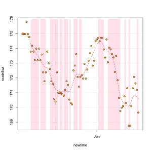
This is a plot of my daily weight from the start of my project until now. Thanks to my Withings scale, weight is one of the few things that I have been able to consistently measure, every single day, without forgetting. Overall, I’m quite excited to have lost about 5 pounds, but I am a bit concerned about the wild swings back and forth. That’s what the holidays do to you, I guess! My detox in mid-January seems to have regained my downward momentum, and I’m hoping here at the end of January I may be establishing a new baseline.
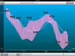
(an aside here about the Withings tool: here is the same plot as rendered using the iPad app – again, click for larger version. Note that this picture has some kind of ‘confidence bands’ which are actually a nice way of visualizing the overall trends and give a sense of the overall variance of the process, or for those geekoids out there, a quick view of the signal to noise ratio.)
Both of these plots show a trendline, which I think is just a simple moving average. You’ll notice that the trendline lags behind the weight swings – which is exactly what you want it to do. Fast weight loss (and gain, to a lesser extent) is not ‘real’, it is mostly temporary due to water weight or simply a stuffed belly. It takes about a week at an established weight level for the trend line to ‘catch up’ — at that point you can more confidently say that you have stabilized at that weight.
One purpose of this project is to see how weight is correlates with other things that I track. Obviously the most important link to weight is food intake. I’ve struggled with being consistent with my food logging- it requires a dedication and diligence I cannot seem to keep up. I was hoping to see how the foods that I eat related to other aspects of my life, and that is hard to do without consistent data. But I did learn something very interesting thanks to my missing data! It is not necessarily *which foods* I log, but rather *whether I log my food at all* which is a good indicator of whether I am losing weight or gaining weight.
The plot below shows the same data as the Withings chart above (I imported the data into R for more flexibility). Here the curve is a standard smoothing curve, and so it does not have the lag. The background pink color is shown on the days where I did regular food logging – the blank days were my lapses in logging. If you look at this closely, you will see that when I am not logging my food, this is when the curve is going up (generally). I think this is mostly psychological — if I know I am ‘off-the-wagon’ and I am eating and snacking more than I should, I tend not to log my food intake. Conversely, if I am really dedicated to food logging on a given day, I am much more likely to eat healthy.
To me, this is at least a small piece of evidence in favor of my hypothesis…that the act of measuring something will affect what is being measured. And although I am kind of disappointed in my inability to stay on the food logging plan consistently, it’s already helped me to learn something interesting about myself.


Feb 12, 2012 @ 16:27:33
Interesting graph/chart. I weigh myself everyday. Strange that after I spend 25 minutes on the tread mill and lift weights and eat only two meals a day, 3 days pwe week, I do not lose a lb. But if I run a 1/4 mile, I lose 2 lbs! My liquor limit is one Manhatten a week….:(. Still doesn’t affect my weight.
Simon V
The “Observer Effect” in Self-Tracking | Measured Me
Dec 05, 2012 @ 14:10:38
Can your iPhone help you lose weight?
Jan 04, 2013 @ 09:20:54
How to Lose Weight Can your iPhone help you lose weight? - How to Lose Weight
Jan 04, 2013 @ 12:12:20
Can your iPhone help you lose weight? - How To Lose Weight | How To Lose Weight
Jan 05, 2013 @ 04:44:25
Lose Weight Blog | Can your iPhone help you lose weight?
Jan 05, 2013 @ 12:17:02
Mar 01, 2013 @ 02:51:19
My developer is trying to convince me to move to .net from PHP.
I have always disliked the idea because of the costs.
But he’s tryiong none the less. I’ve been using Movable-type on several websites for about
a year and am worried about switching to another platform.
I have heard great things about blogengine.net.
Is there a way I can transfer all my wordpress
content into it? Any help would be greatly appreciated!
Apr 18, 2013 @ 01:41:00
Excellent way of describing, and good post to take data concerning my presentation
topic, which i am going to present in college.
Sep 21, 2013 @ 20:20:38
Hello there, just became awaqre of your blog through
Google, and found that it’s really informative.
I’m going to watch out for brussels. I’ll appreciate if you continue this in future.
Many people will be benefited from your writing.
Cheers!
Sep 22, 2013 @ 16:55:18
Hey there! I just wanted to ask if you ever have any problems with hackers? My last blog (wordpress) was hacked and I ended up losing months of hard work due to no back up. Do you have any methods to protect against hackers?
Oct 09, 2013 @ 08:52:05
Every time, you can just play for relax other wise for the highest score.
You can develop these games easily once you become
adept at using a video game programming language such as C.
Like Bejeweled, Zuma is a simple level-and-match game with little diversity and visible
effects.
Oct 19, 2013 @ 21:16:15
Spot on with thiss write-up, I really think this web
site needs much more attention. I’ll probably
be back again to read more, thanks for the info!
Oct 24, 2013 @ 02:10:16
Hi every one, here every person is sharing these
knowledge, so it’s fastidious to read this weblog,
and I used to pay a visit this blog all the time.
Oct 25, 2013 @ 12:32:36
I just like the helpful information you provide to your
articles. I’ll bookmark your weblog and take a look at once more here frequently.
I’m somewhat certain I will learn a lot of new stuff proper here!
Good luck for thee next!
Nov 02, 2013 @ 05:58:00
At this tike I amm going to ddo my breakfast, once having
my breakfast coming over again to read additional news.
Nov 17, 2013 @ 21:15:57
Very quickly this web page will be famous amid all
blogging viewers, due to it’s good posts
Nov 20, 2013 @ 20:08:16
I am genuinely delighted to read this weblog posts which contains plenty of
useful information, thanks for providing these statistics.
Nov 21, 2013 @ 00:53:40
This is the perfect webpage for anybody who would like to understand this topic.
You understand so much its almost tough to argue with you (not that I actually would want to…HaHa).
You definitely put a new spin on a subject that has
been written about for ages. Excellent stuff, just
wonderful!
Nov 27, 2013 @ 23:39:13
It features the first appearance of the three evil viruses cause by her time in Bowser’s
captive. Only one Marine was bitten at this point, Sergeant Jackson, but his Squad Leader reported it as only a stage 3 zombie bite and at this point the affected Marine was
slightly feverish, but still combat functional. Of all units (Barbarian, Archer,Goblin, Giant,
Wall Breaker, Balloon, Wizard, Healer, Dragon and P.
Dec 03, 2013 @ 04:56:40
Undeniably believe that which you said. Your favorite justification seemed to be on
the net the simplest thing to be aware of.
I say to you, I definitely get irked while people think about worries that they just don’t know
about. You managed to hit the nail upon the top and defined out
the whole thing without having side effect , people
can take a signal. Will probably be back to get more. Thanks
Dec 05, 2013 @ 21:50:07
I’m really impressed with your writing skills and also with the layout on your weblog.
Is this a paid theme or did you modify it yourself?
Anyway keep up the nice quality writing, it’s rare to see
a nice blog like this one these days.
Dec 08, 2013 @ 16:54:27
I know this web page provides quality dependent posts and extra stuff, is there any
other web site which offers these kinds of data in quality?
Dec 12, 2013 @ 17:12:23
It’s nearly impossible to find educated people about this
subject, however, you seem like you know what you’re
talking about! Thanks
Dec 28, 2013 @ 16:22:31
all the time i used to read smaller content which as well clear their motive, and that is also happening with this piece of writing which I am reading at this time.
Jan 24, 2014 @ 19:04:44
Excellent post. I was checking continuously this
blog and I’m impressed! Very helpful information specially tthe last part 🙂 I care for such info a lot.
I was seeking this certain information for a vrry long time.
Thank you and best of luck.
Feb 16, 2014 @ 06:29:40
Paragraph writing is also a excitement, if you know after that you can write if not it is complex to write.
Jul 15, 2014 @ 21:07:57
Hi! This is kind of off topic but I need some guidance from an established blog.
Is it difficult to set up your own blog? I’m not very techincal but I can figure things out pretty fast.
I’m thinking about creating my own but I’m not sure where to begin. Do you have
any points or suggestions? Appreciate it
Jul 24, 2014 @ 22:06:57
It’s going to be end of mine day, however before end I
am reading this wonderful piece of writing to increase my
knowledge.
Aug 27, 2014 @ 21:36:35
Do you have a spam issue on this website; I also am a blogger, and I was curious about your situation; we have created some nice methods
and we are looking to trade strategies with other folks, why
not shoot me an e-mail if interested.
Sep 07, 2014 @ 07:25:25
What i don’t understood is in fact how you are no longer really a lot more well-favored than you may be now.
You are very intelligent. You recognize therefore considerably in relation to this topic,
made me in my opinion consider it from a lot of varied angles.
Its like women and men aren’t fascinated unless it
is one thing to accomplish with Lady gaga! Your own stuffs great.
Always maintain it up!
Sep 18, 2014 @ 07:20:52
Hey, just became aware of your blog through Google, and found that it is really informative. I’m gonna watch out for brussels. I’ll be grateful if you continue this in future. Many people will be benefited from your writing. Cheers!
Oct 04, 2014 @ 13:28:02
For the reason that the admin of this site is working, no question very rapidly it
will be famous, due to its quality contents.